Our 2026 Summer Carpet Colour Is Here. Patina Blue!
Patina Blue is emerging as one of the most influential interior colours for summer 2026, especially in soft surface flooring. Instead of bright contrasts, homeowners are choosing colours that feel grounded and welcoming. Patina Blue reflects this shift perfectly. This soft, weathered shade blends blue with subtle green undertones, creating a space that feels open and breathable. When introduced through carpet flooring, it brings depth without overwhelming the room.
Design trends now favour layered spaces that look lived in rather than staged. Patina Blue supports this by offering a colour scheme that feels natural. It echoes coastal tones, aged materials, and quiet textures. These qualities make it suitable for living rooms, bedrooms, and family spaces. Homes influenced by Global Carpets & Hardwood Ltd often adopt hues that enhance comfort while maintaining visual clarity. Patina Blue fits this direction by softening interiors and improving light distribution.
Unlike darker blues, this shade avoids heaviness. Instead, it creates a calm base that pairs easily with warm neutrals. As daylight changes during summer, the colour shifts gently, adding interest without dominating the space. The result is an interior that feels composed yet fresh, which aligns well with the growing preference for subtle colour stories.
How Patina Blue Works Beautifully in Room Carpet Flooring
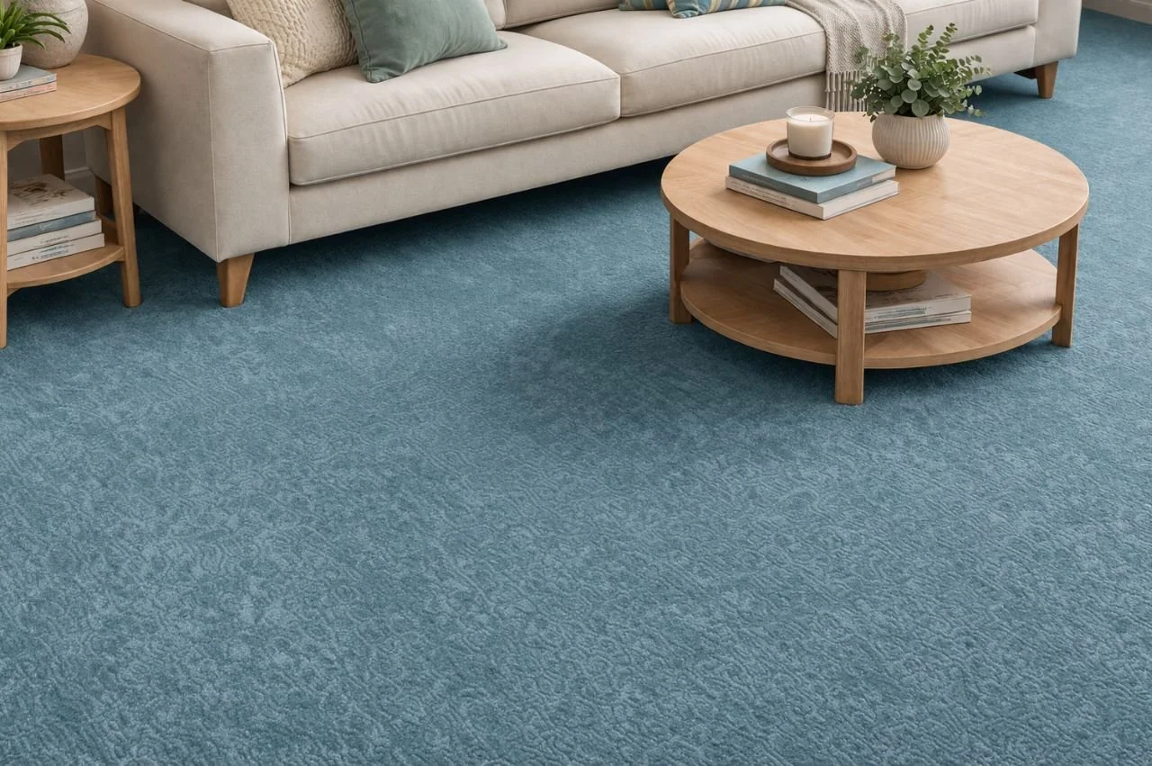
Introducing Patina Blue through room carpet flooring allows the hue to anchor the space naturally. A soft blue floor adds personality to the room and still keeps it cool. This works especially well in family areas where comfort and visual balance matter. The tone complements both modern and classic furniture without demanding attention.
Designers often recommend keeping surrounding elements neutral. Ivory walls, sandy tones, and soft greige upholstery highlight the colour without creating contrast. This keeps the room bright during longer summer days. When selected carefully, Patina Blue enhances openness rather than reducing it.
Many homeowners explore this trend with guidance from Global Carpets. Choosing the right pile height and texture ensures the colour looks great in daily use. Low pile options reflect more light and suit busy areas. Plush textures create a cozy feel for relaxed spaces such as bedrooms.
Another benefit of this shade is its adaptability. Patina Blue pairs well with layered décor, including soft throws, muted cushions, and textured fabrics. These additions reinforce the calming atmosphere. Instead of dominating the room, the flooring becomes a cohesive foundation that ties the design together.
Pairing Patina Blue Carpet Flooring With Warm Woods and Soft Neutrals
Combining Patina Blue with natural materials creates a balanced interior. Warm wood tones complement the gentle blue undertone. This pairing feels inviting and grounded. Light oak, honey maple, and subtle walnut finishes work particularly well in summer-focused spaces.
Using carpet flooring in Patina Blue alongside hardwood flooring defines spaces without breaking visual flow. Living rooms can feature soft carpet while adjacent dining areas maintain wood surfaces. This layout keeps brightness consistent across the home. It also allows each zone to serve its purpose effectively.
Soft neutral accents further enhance the look. Beige cushions, muted sage décor, and warm metallic finishes add depth. These elements allow the colour to stand out quietly. Layering textures also improves the visual experience. Natural fibres and woven fabrics complement the existing tone of the room.
This combination works particularly well in open layouts. Wood flooring provides structure, while carpeted areas introduce comfort. Together they create a cohesive environment suited to longer summer days.
For such tailored recommendations, you can also get a free quote and compare textures and finishes. The right carpet flooring in Patina Blue introduces calmness, enhances brightness, and prepares interiors for the 2026 summer season.
Where Patina Blue Carpet Flooring Looks Best in Modern Homes
Placement plays a key role in achieving the right effect. Bedrooms benefit from Patina Blue because it makes you calm. Family rooms also feel welcoming when soft colour anchors the seating area. Reading corners and home offices do not appear dark but full of soul.
Homes styled with Global Carpets often use colour strategically. Patina Blue can define relaxation zones while keeping other areas neutral. Entryways and kitchens may incorporate practical surfaces like laminate vinyl flooring. This combination maintains durability while supporting a consistent palette.
In open layouts, repeating subtle blue accents in décor strengthens continuity. Curtains, artwork, and upholstered pieces can echo the flooring. This keeps the design cohesive. It also prevents the colour from feeling isolated within the space.
Lighting also enhances this shade. Natural daylight softens the blue tone and reveals its green undertone. Evening lighting creates a slightly deeper look that adds warmth. This versatility allows the flooring to adapt throughout the day. As a result, rooms remain visually interesting without constant changes.
Bring Home Patina Blue With Expert Flooring Guidance From Global Carpets & Hardwood Ltd
Choosing a trending colour requires thoughtful planning. Lighting, furniture, and room size all influence how Patina Blue appears. Consulting experts ensures the colour complements the entire space. Flooring professionals associated with Global Carpets help evaluate these factors carefully.
To explore how this shade fits your home, you can request a free quote and review suitable options. This step allows accurate colour matching based on natural light. Early planning also helps schedule installation before peak summer use.